THIS IS IT, YOU GUYS. The moment you’ve all been waiting for. Well, at least, the moment I’ve been waiting for. I HAVE A COVER AND I’M NOT AFRAID TO USE IT.
*hyperventilates*
It took us several months and a lot of physical and mental trauma to get this cover out. There were moments when I thought we weren’t gonna make it. Getting three authors (THREE SEPARATE PEOPLE, YOU GUYS) to agree on the subtleties and fine-tuning of this cover was an immense struggle, and I am in many ways glad it’s over. NOT LEAST BECAUSE NOW WE HAVE A COVER. AND IT LOOKS GREAT. We owe a ton of credit to our designer, Kevin Weitzel, who came up with the concept for this cover and helped us perfect the execution. His site and portfolio is here, in case you’re interested in seeing some of his other designs.
HERE IT IS.
….
….
….
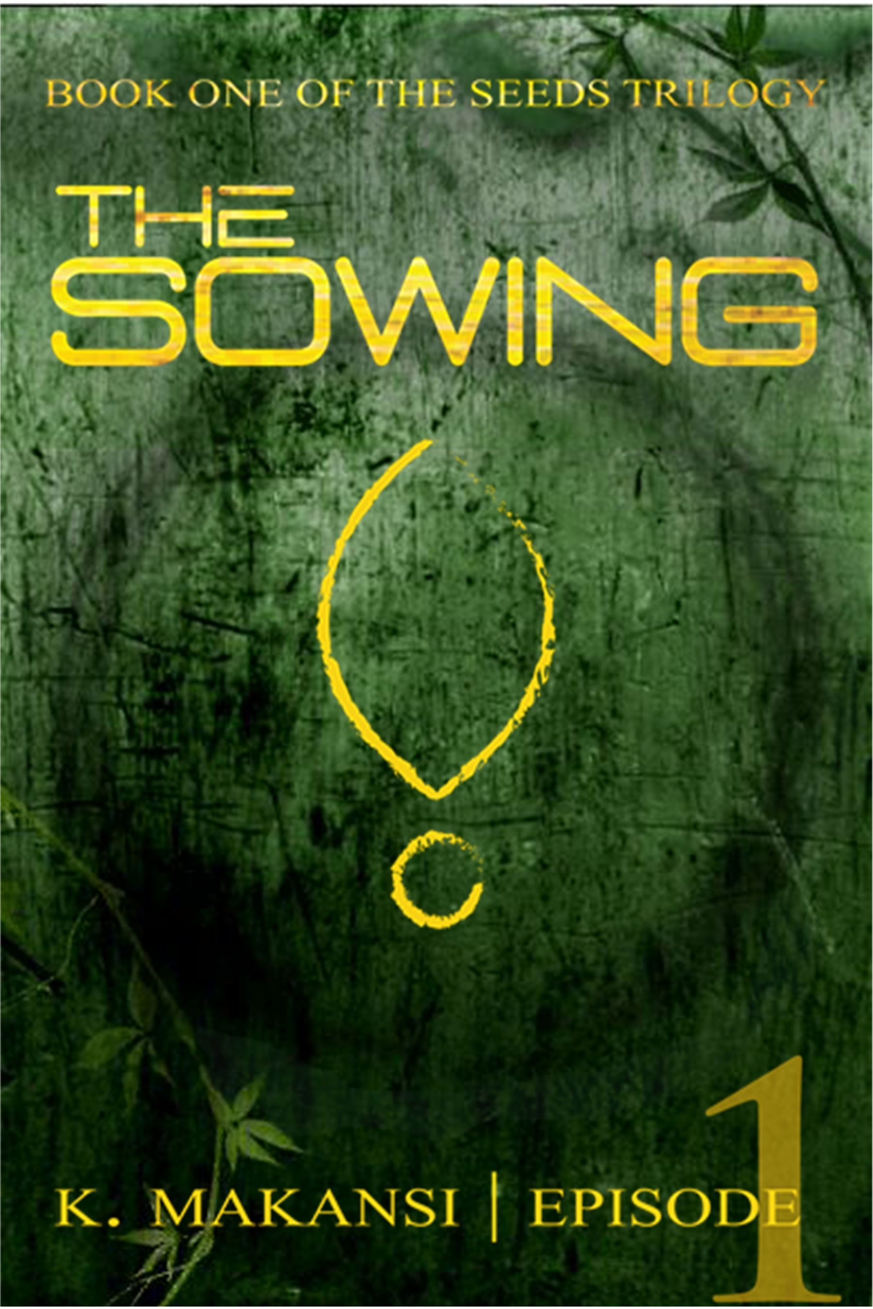
Now, some of you may be wondering why there’s a weird little fishy/exclamation point symbol in the middle. To those with such curiosity, I can only say “just wait”. This is only the cover to Episode One, which is Chapter 1-4 in the book. Many more things will be happening, both inside the book and on the cover, and things may change and evolve over time….
SO! Now that you’ve all sufficiently admired and adored the cover we’ve worked so hard to create, ONTO THE GUIDE.
Here I’ve laid out ten simple steps that will tell you how to create a gripping, powerful book cover, while at the same time successfully avoiding killing anyone, whether by sharp objects, dropping pianos on heads, throttling, or any number of other ways. Here they are:
1) You know that old adage “Never judge a book by its cover”? Throw that right out the window. Out. The. Window. We live in a world where reading time is scarce and has to compete with hundreds of other things – sports, Twitter, Facebook, Candy Crush Saga (it’s an embarrassment to the human race, but there you are), television, movies, etc. Not only that, but, as Madonna so succinctly put it “we are living in a material world.” If your book cover isn’t eye-catching, clean-cut, and professional, people aren’t going to buy your book. Period. The end.
2) Look at other book covers you like. Lots of them. Hundreds of them. Go to bookstores and pick them up, admire them from many angles, and try to figure out why you like that particular cover. Is it simple, or complex? Colorful or stark? Is there a person on the cover? Do you like that person? Would you have chosen a different person? Etc. Think about all these questions and more.
3) Think about your book and what kind of feel it has. Is it lighthearted or serious? Is it philosophical or a gripping thriller? What genre does it fit into? Remember, the goal of a book cover is to market your book – it should say something about what kind of a book it is, maybe about what age group it targets, and about what the reader can expect to find inside.
4) Now think about how that feel can be translated into visual imagery. In the case of THE SOWING, our book is, for the most part, a dark, serious adventure story. It’s set in a post-apocalyptic, dystopian world, where society has strong parallels to our current age. There’s comedy, absolutely, and there’s a hell of a lot of symbolism. It’s also a lot about plants. And growing things. So we tried to reflect all of these things in our cover. The green symbolizes plant life, growing things, coming back to life. The scratched metallic background being taken over by ivy represents the ruin of our current world. The gold font choices symbolize luxury, materialism, and power. And the gold symbol in the foreground represents … ha ha! Gotcha there. You’ll just have to wait and see. The trick is to do that same thing with YOUR book. Pick themes, ideas, and environments from your book that can be represented via symbolism and try to convey those onto the cover. Don’t know what symbolism is or how to use it? Go pick up Joseph Campbell’s “The Hero With A Thousand Faces”. (Actually, do that anyway.)
5) Now’s the tricky part. Either learn to use the basics of Adobe Photoshop and/or Adobe Illustrator and/or GIMP (the free version of the other two) OR find a graphic designer whose style fits with your vision. Unless you’re already in the book industry, I’d recommend either learning to use GIMP (because it won’t cost you your firstborn child) or finding a designer whose services are within your pay area. GIMP, because it’s freeware, has a ton of crowdsourced user-support information online. That doesn’t make it any easier to learn, but it does mean that when you get stuck, there will always be somewhere to turn. No matter what you do, however, DO NOT SKIP THIS STEP. As I mentioned in #1, having a professional-looking cover is critical to book success. Not only that, but it will make you really, really happy.
6) If you hired a graphic designer, do not kill him or her. Just because she does not understand your vision does not mean that she deserves the death penalty. Just because he didn’t inch your title up those few pixels does not mean you are entitled to Force-choke him. Just because it takes time and painstaking communication with your designer to achieve the perfect cover does not mean that you may drop a piano on his head (or the heads of your co-authors, in my case). This was a difficult lesson for me to learn.
7) Come up with about a million (or at least seven) different ‘concepts’. These are general ideas that you can hone and tighten to create a finalized cover. In our case, we had over fourteen general ideas before we finally found one we loved. Any of them *could* have gone on to become the final cover, but we weren’t in love with them. So we kept concept-ing and concept-ing until we had an idea we just couldn’t let go.
8) Show your cover concept to your beta-readers, friends, and family. Do they “get” it? Do they like it? Do they think it fits in with the feel of the book? Remember, your goal isn’t to ‘please all comers’ but to find a cover that YOU love and that best represents your book to a potential buyer. Once your readers (and most importantly, YOU) have a concept that works, you have to edit and hone it to make it perfect.
9) Look at your cover in thumbnail form. This is especially critical for indie authors who will be doing most of their selling digitally. If you can’t at least see the title of the book in the thumbnail, you have a problem. If the cover doesn’t look good to an Amazon customer looking at your book in the “Recommended For You” or “Customers Also Purchased” section, that person won’t click to your book’s page. The cover should be eye-catching and dramatic even in tiny, miniscule form. You need to go back and play around with your foreground and background colors to make sure that your title pops out to the eye – and preferably, that all of the elements on your cover are strong and definitive as well.
10) COVER REVEAL. Now’s the time for you to show off all your hard work. Spread word via all of your social networks that your book has a cover and TELL EVERYONE HOW MUCH YOU LOVE IT.
The end.
So, readers, what do you think? Do you like our cover? Would you pick it up if you saw it in a bookstore? What are some of your favorite book covers of all time?

This looks fantastic!
Thanks! We love it 🙂
Love the title font, love the texture–it adds so much depth and mood, though it’s a nicely simple design. The symbol is intriguing. All-in-all… I like it. 😉
Love the design! Add me to your blog and follow my blog so we can share some graphic design ideas
Thanks! I followed you. Looking forward to checking out your posts!
Love it! Looks kind of eco-thriller / dystopian / … something awesome 😀
Thanks, lady! You’ve got all the genres down pat!