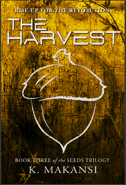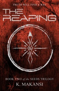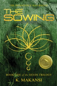
It’s been a long time coming, but the cover for THE HARVEST, the third book in the SEEDS trilogy, is finally here!
For those of you interested in the process of book design, here are some notes about our process:
This cover was possibly the hardest one we’ve done so far from a design perspective. We conceived of the gold background three years ago when we designed our first cover, and we’ve been in love with it ever since. Not to mention that the autumnal yellow-brown color fits perfectly with the concept of harvest season, autumn, and the gold just feels like the climactic end of a story. However, even though the color is stark, eye-catching, and beautiful, it was technically very hard to work with. Almost because gold is so eye-catching, it was hard to find a font color for the typeface that stood out clearly but also wasn’t stark white or black. The color we ultimately went for is a chalky grey that reminds me of marble and limestone, and highlights the title, the fonts, and the symbol, while not being too distinct. It stands out while blending in, if that makes sense.
The subtle work we did on the book’s title, THE HARVEST, turned out to be incredibly important. The drop shadow sets the title out just a little bit from the rest of the cover, and lends it an additional sci-fi like quality that is a very clear hallmark of the genre for our books. The subtle cracks in the typeface, too, help emphasize the genre: it gives it an eerie, crumbling feel that lends itself perfectly to the dystopian setting of the Seeds trilogy.
And finally, the acorn itself – as with all our symbols, this one is highly relevant to the plot and themes of the third book. While the compass in THE REAPING was largely symbolic and didn’t play much of a role in the plot points, the lotus on the cover of THE SOWING was critical, and the acorn in the third book is both thematically important and a key aspect of the story. But I can say no more without giving too much away!
So, what do you think? Do you love it as much as we do? Do you hate it? Does it make you excited to pick up the third book in just a few months’ time? Or to start at the beginning with The Sowing? I’d love to hear from you!


I appreciate you explaining your thought process behind cover design. I think all three covers are much the same, so no doubt you are satisfied with your cover.
Omg omg omg … I. Can. Not. Wait. These covers are gorgeous! Will you offer a box set at some point in the future?
I certainly hope so! I would love to do one a few months after The Harvest is out, and I would even more love to do hardbacks. But that might be dreaming!
Just. Wow!
Quite the epic 🙂 Congratulations.
Hurrah! Awesome cover, great trilogy. Nice job! What an epic adventure, not just talking about the story.
Thank you! So glad you like it. Always reassuring to hear from an artist that it works 🙂